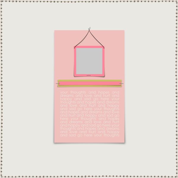
I have found myself suddenly addicted to the simple page. One with more focus on the photo and the journaling. I know not all people enjoy these kinds of templates but I thought I would offer one to you today. It has shadows on separate layers that are bent a little. Those can be removed and your own shadows added. All the layers are adjustable just the same as a regular template. I would love to hear some feedback on if you would like to see more like this or if I should stick to my other style. :) Enjoy!
CLICK HERE

{scrapflower} blog buzz bonanza
13 years ago


14 comments:
It looks awesome! Thank you so much!!
love the template! thanks so much!
I'm a big fan of the minimalist page, big thumbs up from me!!
i am a huuuuge fan of your layouts, therefore i am a huge fan of your templates!! i think this is a fantastic template and will get me to focus on journaling, which is something I've been trying to get more into doing. <3 thank you so much!
Lovely! And I've been trying to often include more journaling, so this is perfect. Thanks so much!
It is a wonderful template, thank you so much-I am especially glad for the bends, I am not good at thoses
Just a quick note to let you know that a link to this post will be placed on CraftCrave in the DigiFree category today [27 Jul 12:00pm GMT]. Thanks, Maria
This is such a great template... thank you so much for sharing... I can see this being using for much more than just a scrapbook page... like a card! THanks again!!!
SO cute! Thank you so much! :D
I love these kinds of templates, thank you so much for sharing! :) ♥
great template - thank you for sharing!!
Too stinkin cute! Thanks for sharing. :)
love this! Can't wait to try it out.
This template helped me write more I usually do. I tend to be minimalistic with my journaling more than my layouts! lol
http://digiscrapobsession.net/pics/showphoto.php?photo=10351&nocache=1
Post a Comment